

Helping a global brand bring metal packaging to life
Trivium are a global metal packaging brand, with locations in over 60 countries, offering a range of packaging solutions for a wide variety of markets and products. The Trivium brand was the result of a 2019 merger of existing businesses, and as such faced a challenge to build brand awareness and form a strong digital presence. When approaching the redesign of the Trivium site, it became clear there were three main obstacles within this wider overall challenge.
Firstly, as a B2B brand, Trivium were struggling to bring their packaging to life, and sell the consumer benefits of their products to customers - with too much focus on the more technical aspects of packaging.
Secondly, the lack of ‘life’ also extended to the digital expression of the brand, which lacked impact. An already fairly corporate brand was being used in a way that - whilst functional - did not excite or drive engagement.
Thirdly, the existing site was riddled with confusing UX design choices, taking the already complex matrix of products and markets that Trivium provide for, and making it even more difficult to understand. Customers and new prospects needed to quickly and easily understand Trivium’s market and product expertise, leading to more enquiries and ultimately more business.
Project tasks
Digital brand strategy
UI design and direction
Design system and production
Packaging design and direction
Photography art direction
The three creative challenges were tackled in two main streams of work, running in tandem. The first stream of work was focused on the visual expression of the brand – not just through the digital design process, but also through brand imagery creation.
Trivium needed imagery to show the range and depth of the products they create, and demonstrate the connection between what they do, and the products consumers buy – all in a visually striking way. However, as a business that is often driven by the needs of the consumer brands they serve, Trivium lacked engagingly branded packaging.
To address this we went through an explorative packaging design exercise, before refining the designs into an overall cohesive but flexible design system, with 15 different imagined brands and products designed for across eight different markets.

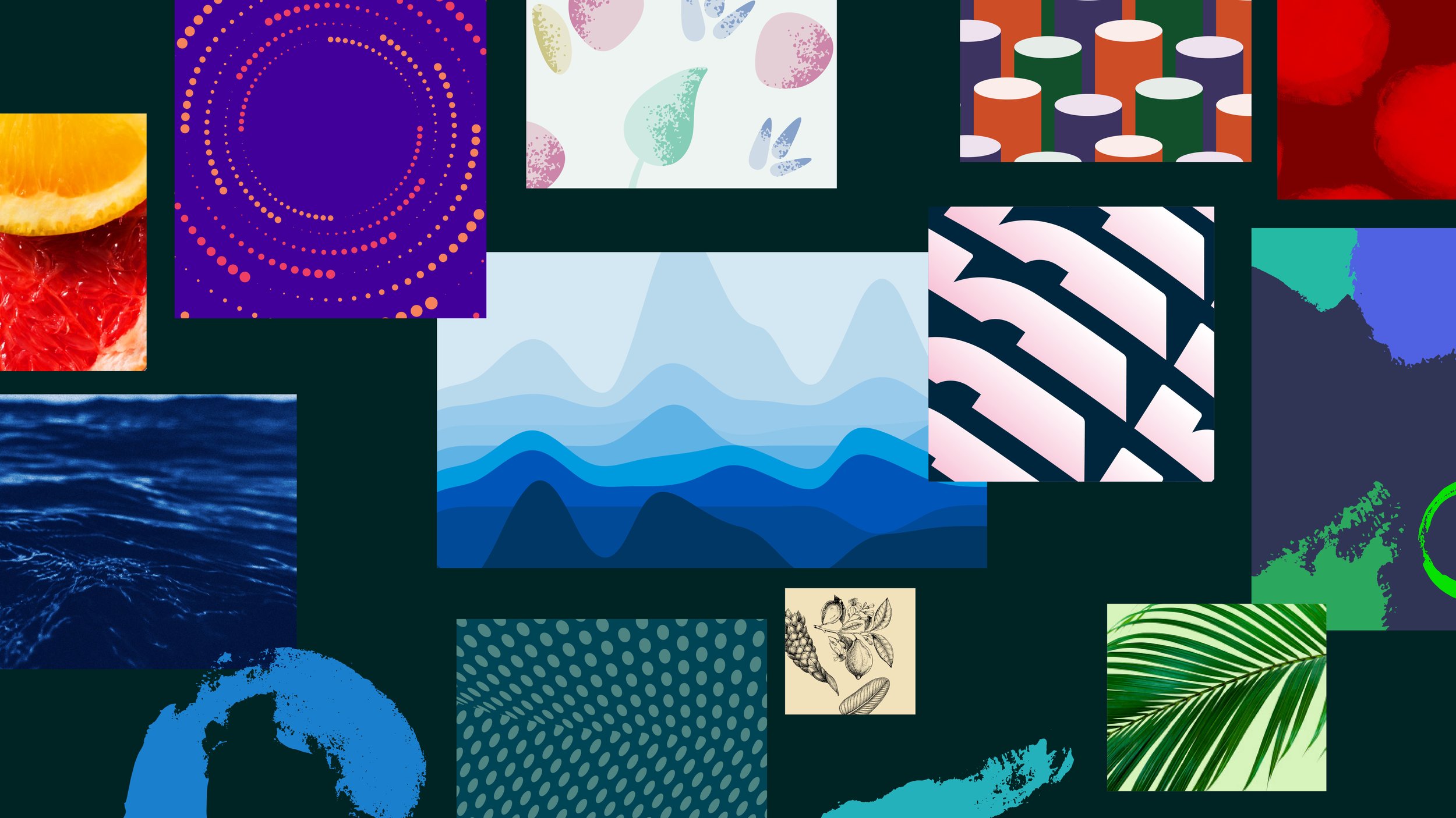
Once the packaging designs were finalised and turned into printed prototypes, it was time to get them in front of the camera. Working alongside award winning photographer Slater King and his team, I art directed a three-day photoshoot featuring the design products, using models and residential locations to create impactful and ownable Trivium brand imagery. Eight image sets were shot, with a wide range of lifestyle and product focused shots created for each of Trivium’s markets.


Whilst the first creative work stream was focused on generating exceptional brand imagery for Trivum, the second creative workstream was focused on the visual and experience design approach of the website.
The process was kicked off with a thorough UX and IA stage, consisting of interviews, user research, journey mapping and content structuring. I worked alongside the digital strategy team during the process, building an understanding of the strategic goals the site design needed to deliver on.
After this stage I lead the design team through visual direction exploration, during which we explored how we could build on the existing - if somewhat limited - brand identity that Trivium had in place. Some elements couldn’t change, but a new approach to colour, more dynamic layout choices, and a sharper typographic tack meant we were able to elevate the brand considerably.
Our design exploration led us to settling on a particular design direction - one that mixed impact with flexibility and pragmatism. We then worked on turning this into a comprehensive design system to support the wide array of content and page types the site needed to house.


The design system was implemented across over a dozen different key page and template types, based on a cohesive but adaptable library of styles, elements and components. This consistency ensures the site works as a singular piece of design, despite its varied content types and requirements. Responsive design principles are baked into the design approach, ensuring the site looks good and works well at all breakpoints. The library and design system also enable easy future additions and improvements as the business, and their online presence, continue to grow.


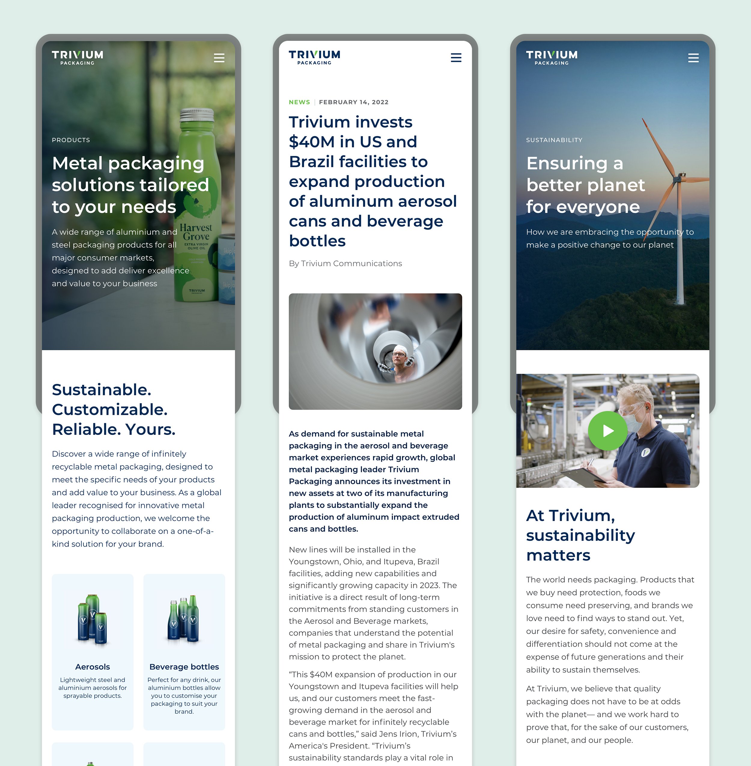
The brand imagery created from the packaging designs and photoshoots plays a key visual role in the site. The images create impact, and bring colour and life to what Trivium actually produce, and the benefits it creates for people around the world.
To complete the narrative being told by these images, we also visited some of Trivium’s European office and production locations for another three days of shooting - this time capturing the technology, people and innovation behind the products.


