Islington
Brand and digital refresh for Islington borough council

A brand and digital refresh for Islington Borough Council
Islington Borough Council are proud to be part of a vibrant, collaborative community, but felt their existing visual identity - despite being well recognised across the borough and wider London - was not reflective of their character or approach.
Additionally, elements of the identity had been in place for the best part of 15 years, and had become somewhat dated. The identity was being applied inconsistently across different media and had struggled to keep up with the digital transformation of borough services, being poorly translated to digital applications.
The identity had a key visual element - the ‘thread’ - a ribbon like graphic device, which helped knit the identity together. The thread had great recognition, but needed updating, with quite specific needs to make it easier to apply - whilst becoming more visually dynamic. Alongside this key task, the brief covered a wide range of brand and digital assets, including harmonising print and digital colour palettes, typography, iconography, and print and digital templates.
Project tasks
Identity design
Digital design
Project design direction
Brand guidelines

The old brand had become inconsistent and dated, with a design system that was not working for digital applications. Internal teams did not have the design framework needed to bring the brand back in line, and felt hampered by the inflexibility of the existing design system.

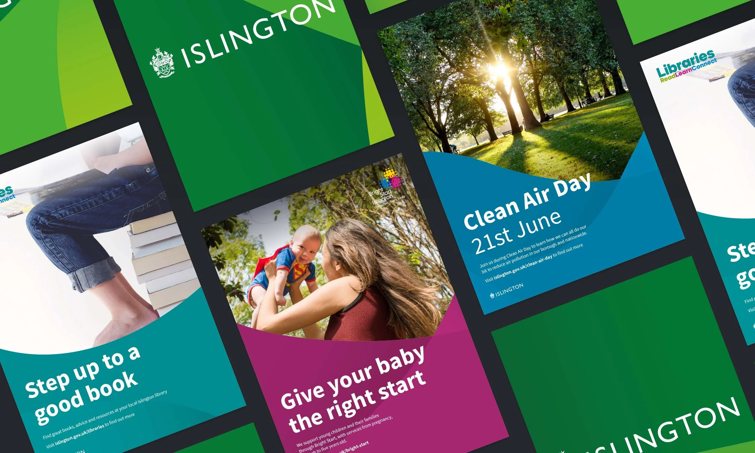
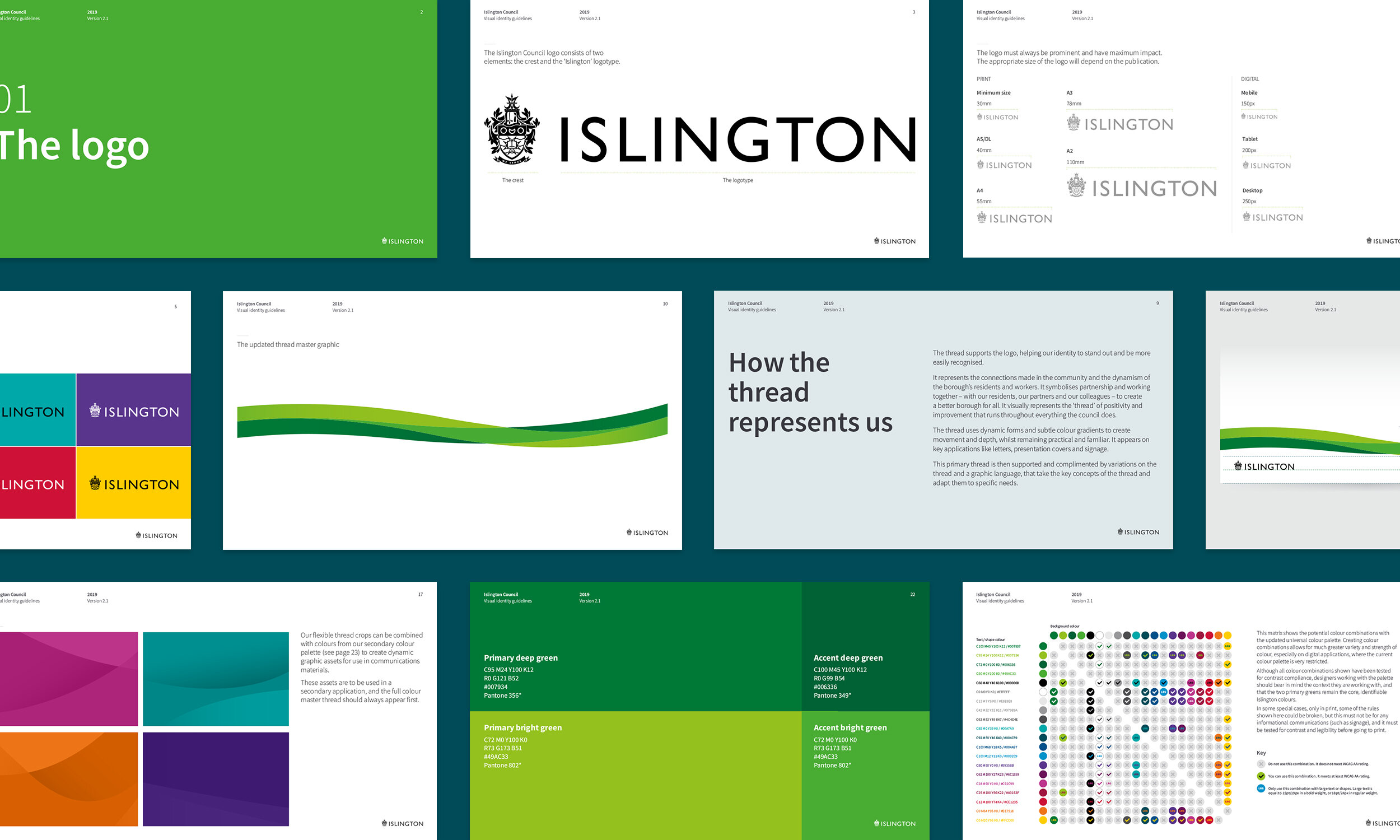
Updating the thread was a key starting point - it had formed the backbone of the previous identity, and to maintain the recognition the brand had across the borough, it needed to do the same now. Several important changes were made to the thread to make it more representative of the borough, more appealing, and more robust.


Alongside the updated primary thread, was a whole new approach - expanding the thread into a flexible but coherent visual system. The new approach means the thread can be applied consistently across functional touchpoints, but become much more expressive when the brand needs to grab attention - suiting a wider range of needs.
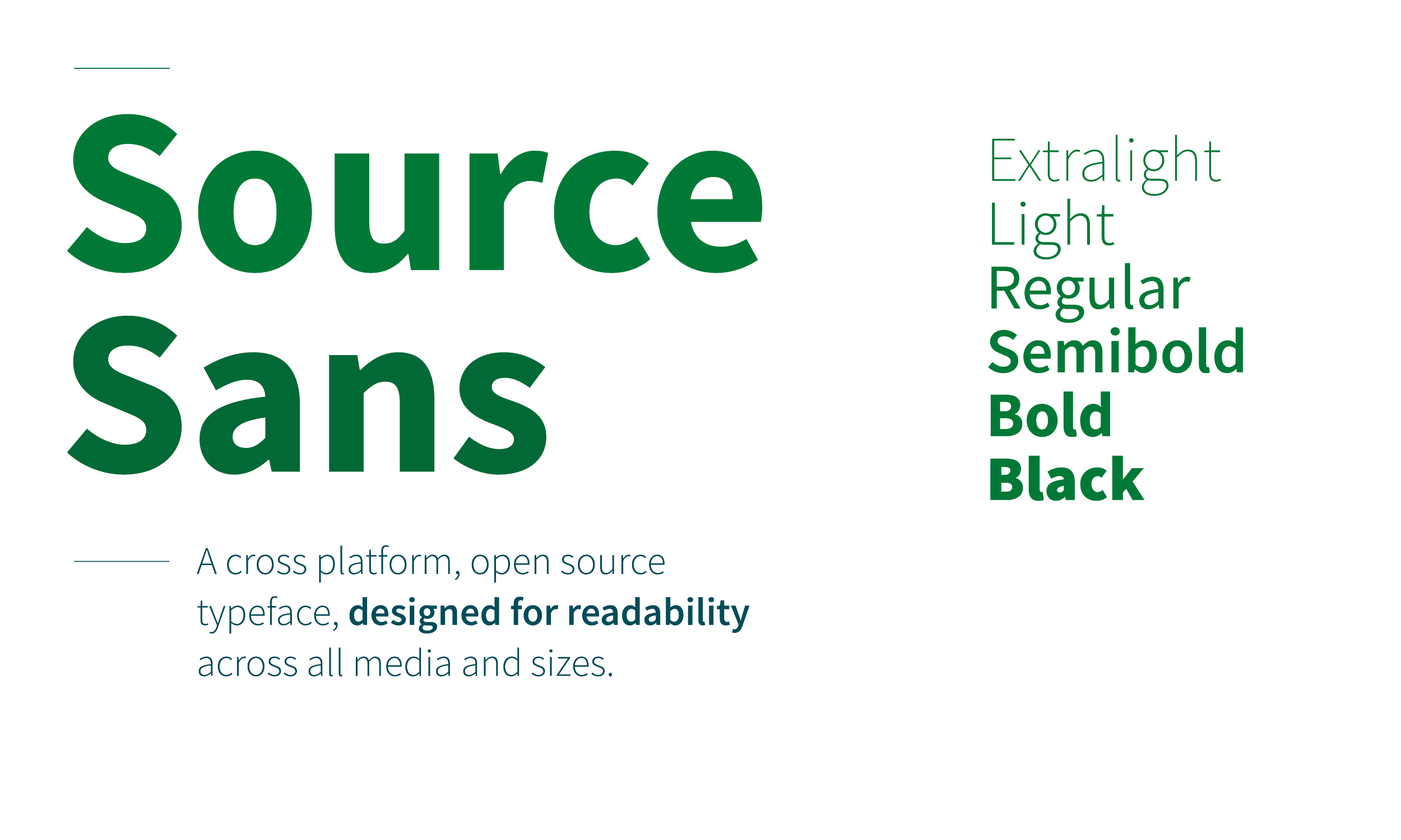
Evolving the typographic approach was key. The existing identity utilised far too many different typefaces, with different typefaces for printed communications, documentation and digital applications.
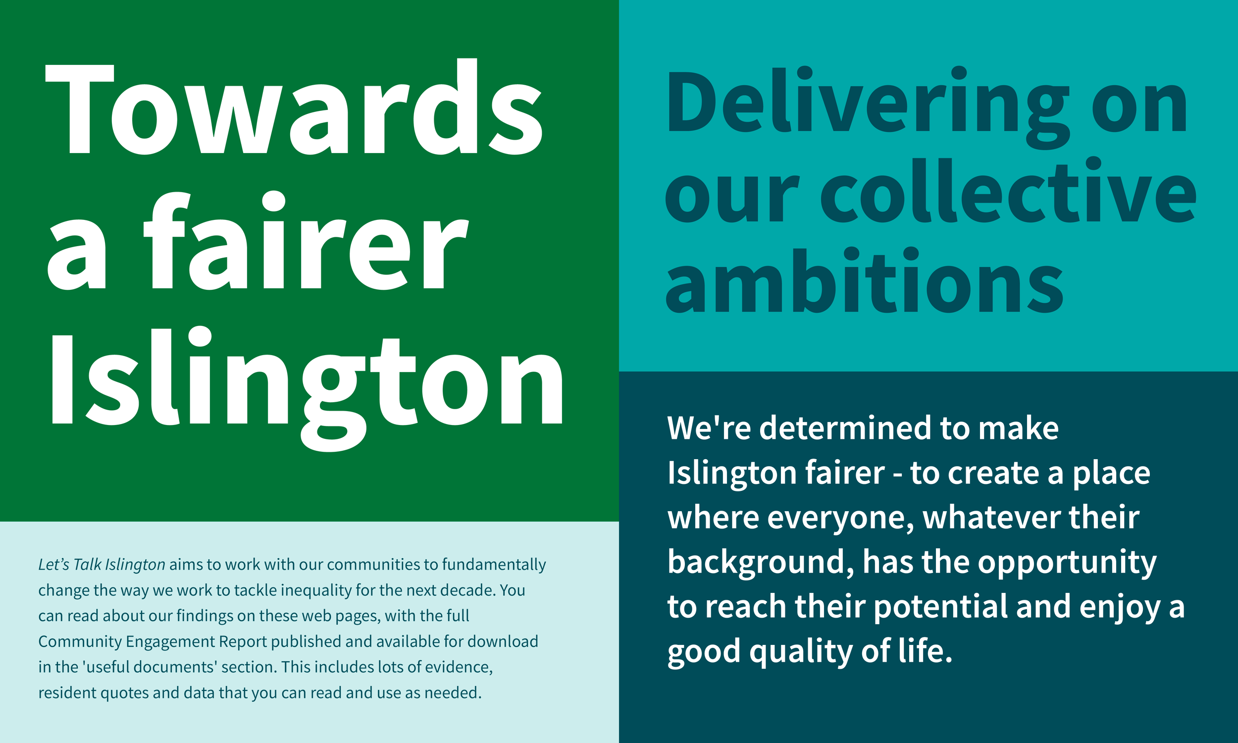
The new approach unifies the type style, and takes the brand in a more characterful, but equally more functional direction. For a brand providing public services, accessibility is vital - so legibility and ease of use are as important in the decision making process as creating an engaging visual style.
The typographic style guidance was included in a unified set of brand guidelines, alongside direction on the thread system, and a fully WCAG compliant accessible colour palette.
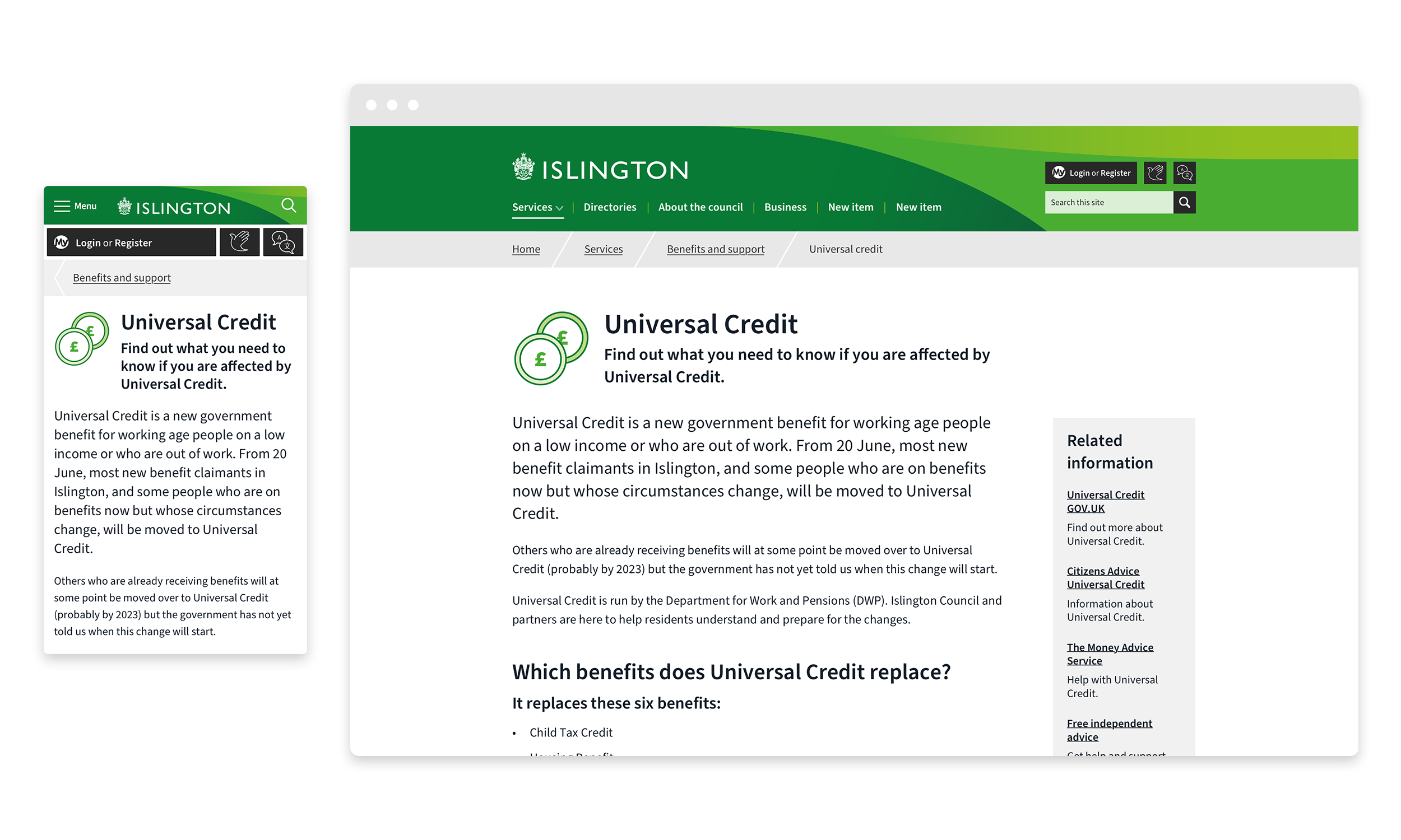
Alongside the primary brand guidelines, I also developed digital designs and design system guidelines for a wide range of content types and components, including iconography, page layouts, and a responsive type scale. These designs implemented the new brand style but also made key UI improvements, improving accessibility and making the site feel fresher and more modern.

