A new brand identity for the greener fuel choice
Autogas - a joint venture from Calor and Shell - produce liquid petroleum gas, which is a cleaner and more cost effective alternative to petrol and diesel. With a presence on over 500 forecourts in the UK, Autogas was the largest LPG brand - but was still struggling with brand perception and converting drivers.
The existing brand did little to help drive engagement - borrowing its design direction from the old Calor logo, the identity felt industrial and overly-masculine - meaning it was unable to appeal to everyday consumers. While the name couldn’t change, it wasn’t helping matters either - the ‘gas’ element being quite misleading and not indicating that LPG is a liquid fuel just like petrol and diesel.
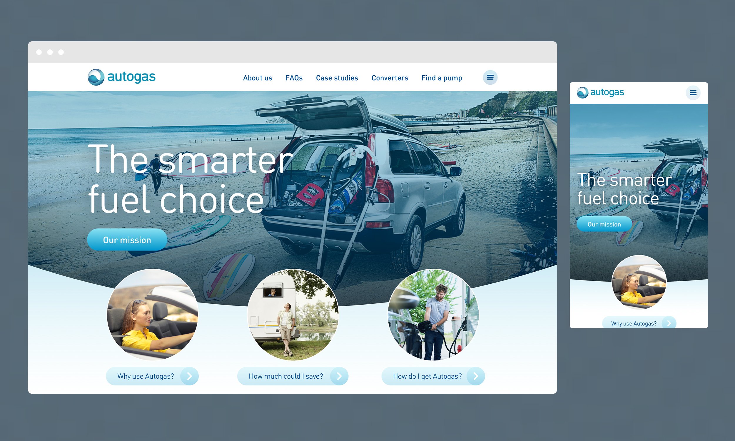
I worked alongside a wider creative team, and we developed a new brand identity for Autogas, based on the key concepts of sustainability, fluidity and motion. The new design was bright, bold and impactful - essential for Autogas to be able to create standout on the forecourt.
Project tasks
Design direction
Identity design
Print and livery design
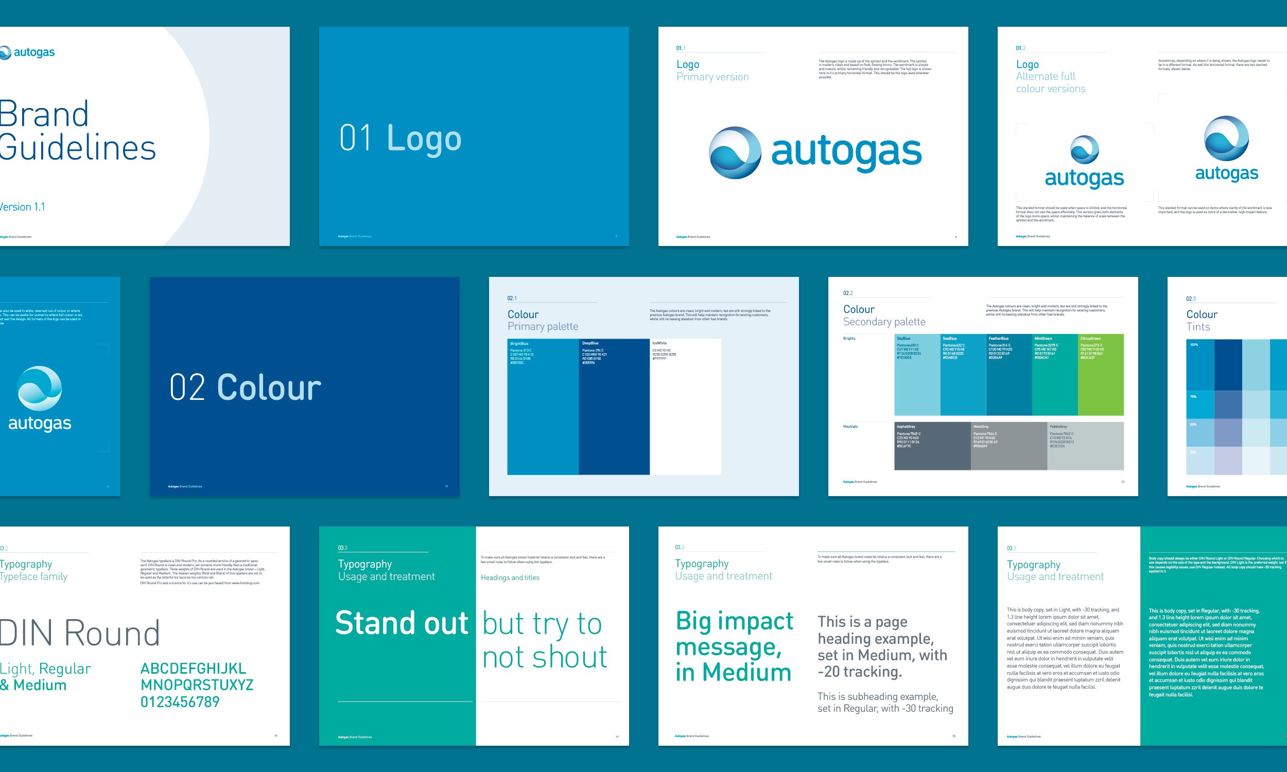
Brand guidelines


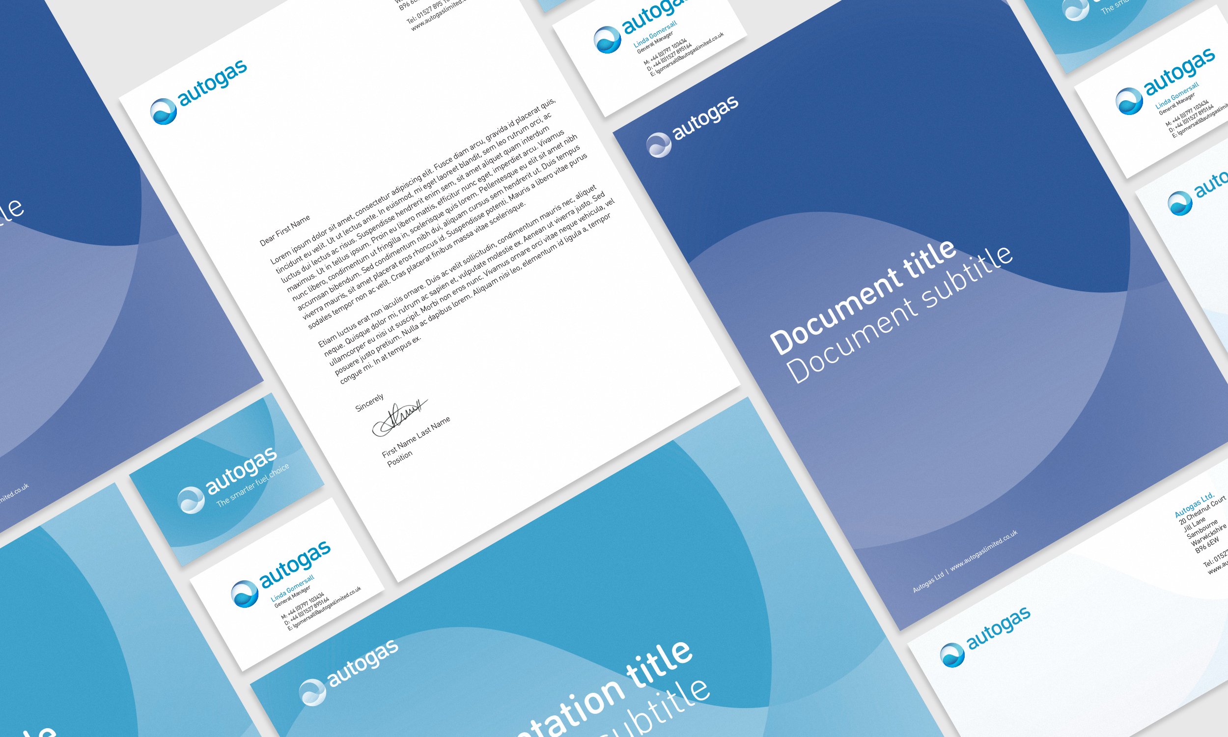
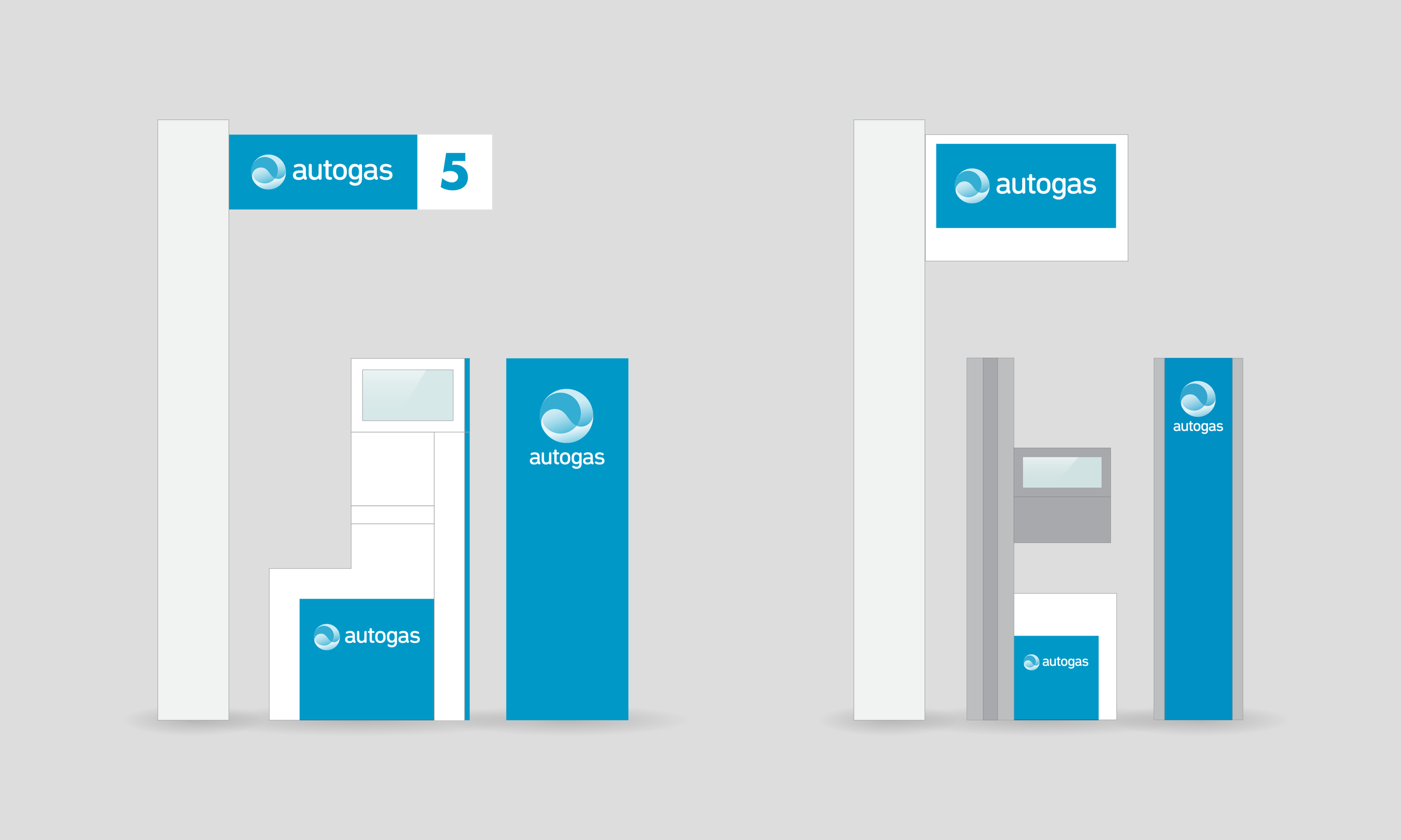
The new identity was rolled out across forecourt and vehicle livery, advertising, corporate templates, promotional materials and digital channels. Alongside the new look, a new messaging platform was developed, aiming to focus on the simplicity and ease of converting to, and using, Autogas. I also wrote and designed a full set of brand guidelines to enable further brand applications.