A COMPANION APP FOR an innovative HEALTHCARE technology
Smith+Nephew are a global medical brand developing advanced technologies across a number of categories, including implants, robotics, sports medicine and wound management. They were launching a game changing new piece of technology, and needed a way to get it into the hands of healthcare practitioners and guide them through how to best utilise it.
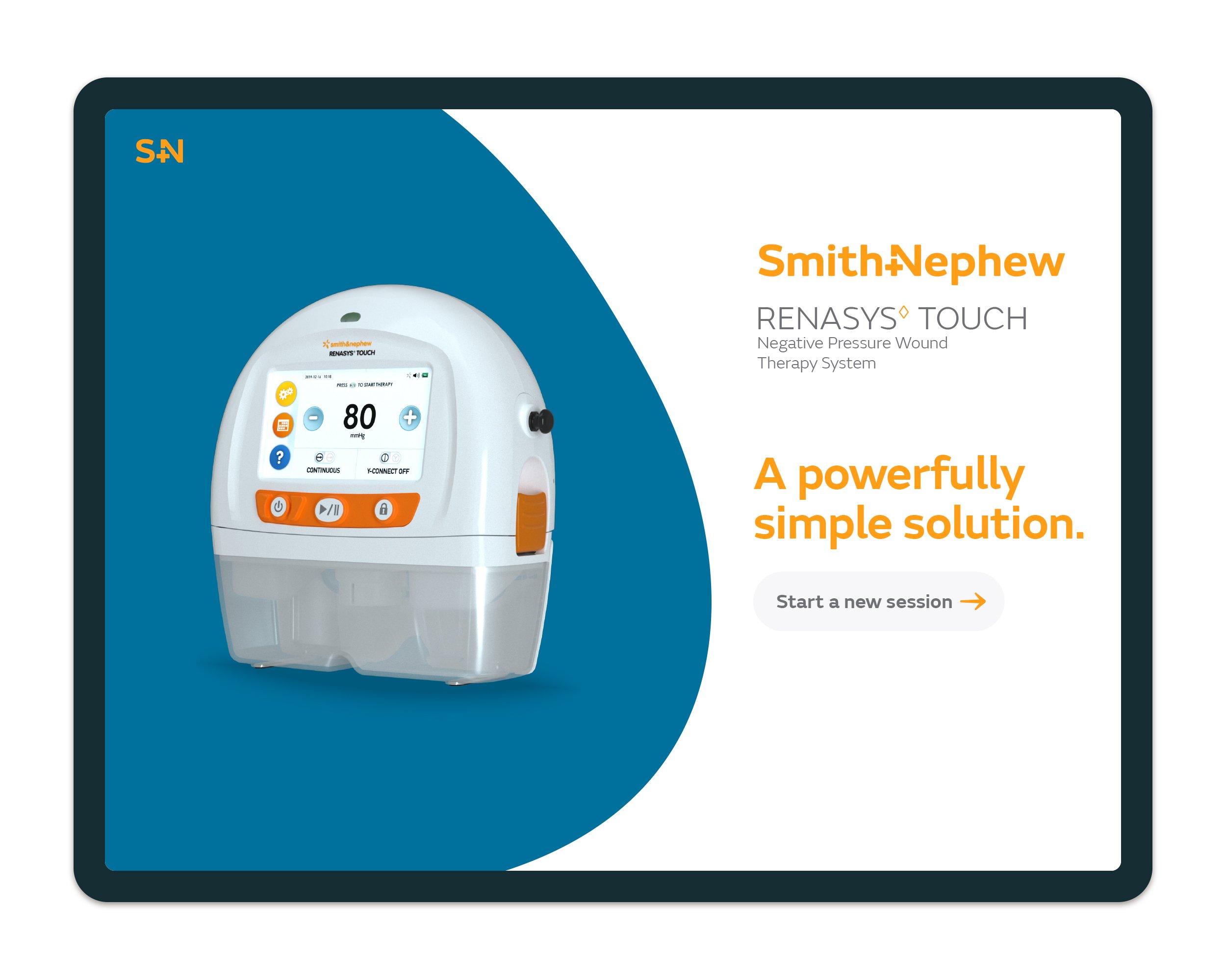
Renasys Touch is a negative pressure wound therapy device that essentially creates a complete vacuum around and then intelligently manages the healing process. With built in connectivity, device tracking, step by step guidance and easy-to-use interface, Renasys Touch makes a potential complex situation as straightforward as possible. This sense of simplicity was reflected in the positioning to promote the device, and was a core thought throughout the creative development the campaign.
The primary output from the campaign was a ‘companion’ iPad app that sales and products teams could use to demonstrate and then educate on usage of the device. The app was designed to be highly intuitive, and driven by user need - aligning with the sense of powerful simplicity inherent in the Renasys device.
Project tasks
UX concepts and design
Visual design direction
UI design direction
and implementationInformation and icon design

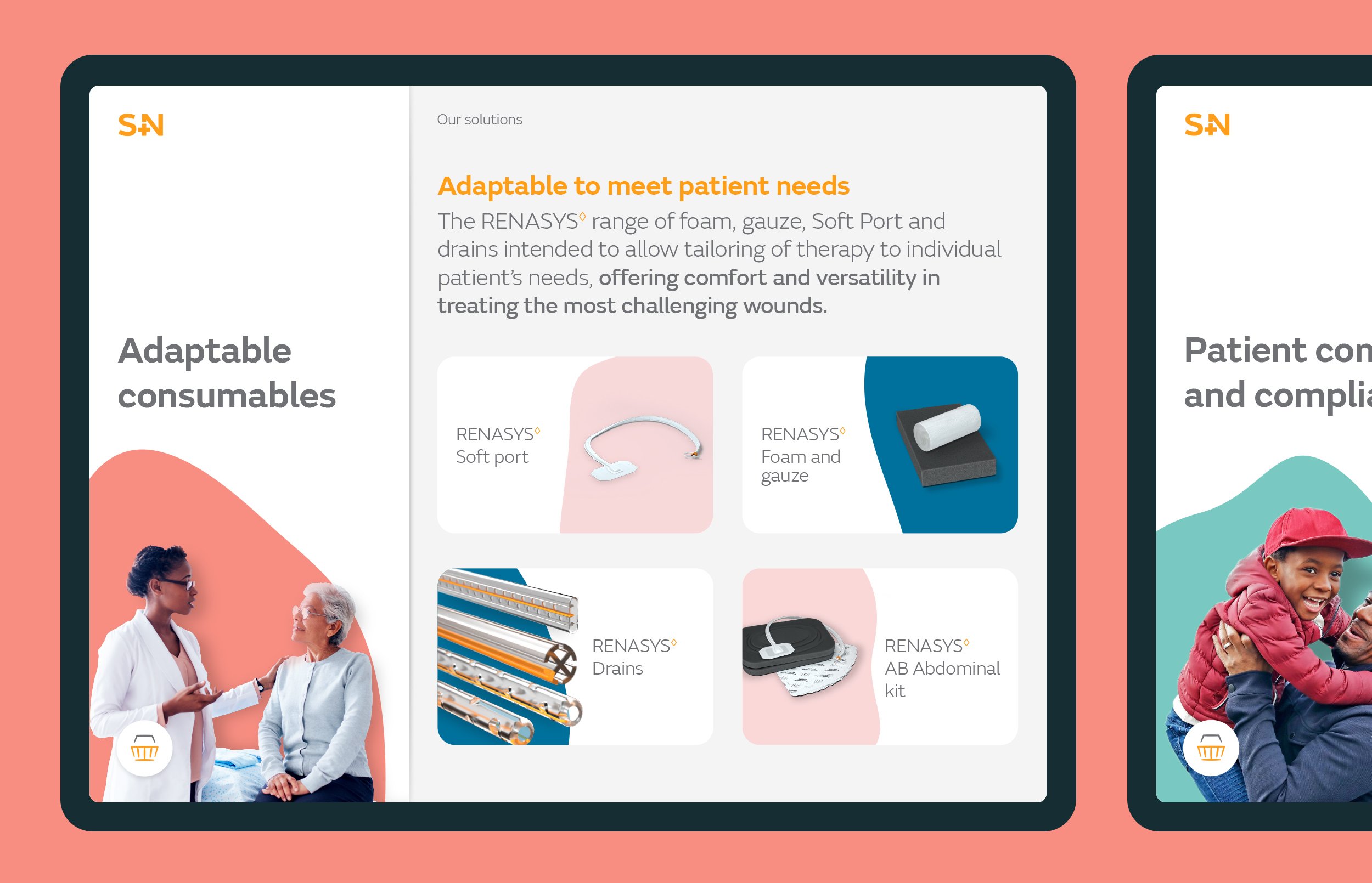
Medical device promotional materials are typically very dry, complex and focus on specific technological features and claims. The approach taken on the Renasys app was intentionally different. After going through an intensive content and UX process, during which I worked alongside the strategy team and a copywriter, we arrived at a content approach that was driven first by needs, answered with features. This would allow Smith+Nephew’s product teams to create a better connections with HCPs and show them how the device could improve the wound management scenarios they were experiencing day-to-day.
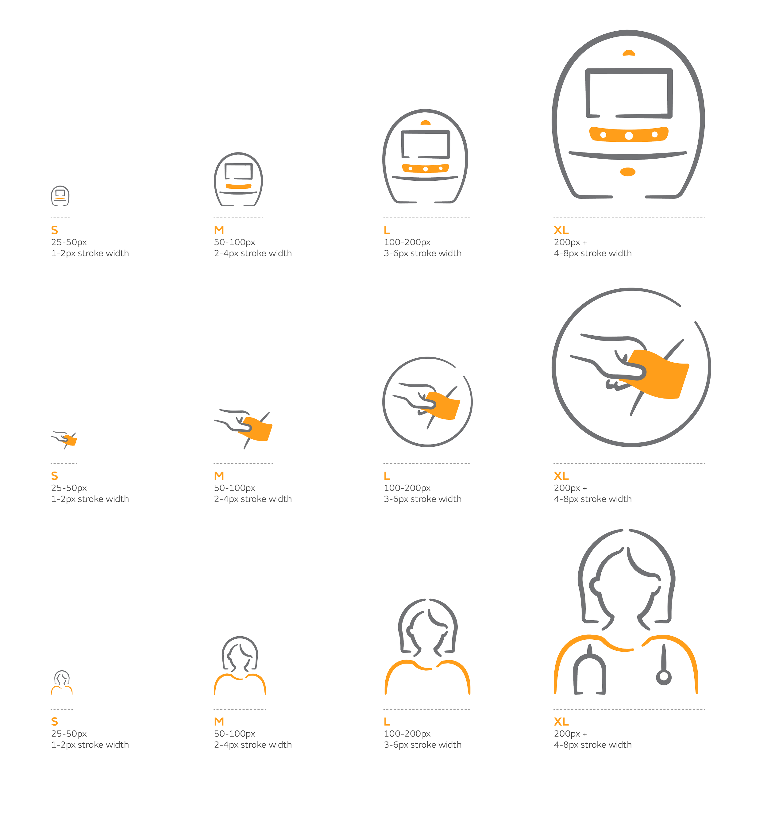
This content approach led to a simple and intuitive user journey for each need, that explored the challenges, before presenting the advances and features of the device. This was coupled with a clean but vibrant and engaging design direction, with strong uses of colour to create clearly delineated sections throughout the experience. As one of the more functional elements, I created a responsive infographic and icon system that created a consistent visual look no matter the complexity of information.